Last spring, my daughter Sophie held two paint cards against our bedroom wall and announced that both were “basically white,” which is exactly how adults get into trouble with paint. One looked gray by evening; the other turned yellow beside our wood dresser. If you are considering ivory tusk paint color, you are probably after that same soft, warm backdrop without creating a room that feels beige and dated. It can be a lovely bedroom choice, but the surrounding light, flooring, and fabrics matter more than the tiny paint chip suggests.
What ivory tusk paint color actually looks like
Ivory tusk paint color sits in the warm off-white family. It is lighter and cleaner than a traditional tan, but it has enough creamy warmth to avoid the stark feeling of a bright, blue-leaning white. In a bedroom, that distinction is useful. Cool whites can feel crisp in a sunny showroom and chilly at 9 PM when you are trying to read. A warm ivory tends to make bedding, wood furniture, and woven textures feel more connected.
The final result changes with exposure. In a north-facing San Francisco room, the color can read soft and slightly muted. In a south-facing room, afternoon light may pull out more cream. LED bulbs also matter. A 2700K bulb will make the walls look warmer than a 3500K bulb, which can make the same paint appear more neutral.
That is why I never approve a bedroom color from a screen or a two-inch sample. Paint a board at least 18 by 24 inches, move it around the room, and look at it in the morning, afternoon, and after the lamps come on. Your bedroom does not have to be perfect. It just has to be yours.
The best bedroom pairings for this warm ivory
Ivory tusk paint color is especially easy to live with when the room already contains warm materials. Think oak nightstands, walnut picture frames, cane baskets, linen curtains, and a rug with tan or oatmeal threads. These elements keep the walls from looking disconnected from the furniture.
For bedding, I would start with white, flax, sand, or faded blue. A white duvet from Parachute or a simple cotton cover from Target can work equally well because the wall provides a gentle contrast instead of competing with the bed. Add one darker note, such as a charcoal lumbar pillow, espresso wood bench, or bronze reading lamp, so the room does not become one uninterrupted pale block.
If you love color, try dusty sage, muted terracotta, denim blue, or a brownish rose. These shades feel collected rather than overly coordinated. In my own room, a warm ivory wall with olive linen pillowcases made our old oak dresser look intentional again. The dresser was not suddenly better furniture; it simply had a calmer background.
How lighting changes the color
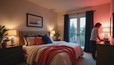
Before using ivory tusk paint color on every wall, study the room's artificial lighting. A bedroom with one overhead fixture and no bedside lamps will usually look flatter and darker than a room with layered light. I like a ceiling fixture for general illumination, a shaded lamp on each side of the bed, and a small directional light for reading.
The shade material affects the walls, too. A linen shade softens the light and keeps the color comfortable. A clear glass lamp with a bright exposed bulb can make warm paint look more saturated. For bedside lighting, the Schoolhouse Luna Table Lamp is a polished option, while the IKEA Forsa remains a practical choice when you need an adjustable lamp for under about $40. The important feature is not the label; it is placing the light where your eyes need it.
If your room has strong daylight, sample the paint beside the trim and window casing. If the trim is a very cool white, the ivory wall may look creamier by comparison. That contrast can be beautiful, but it should be deliberate. Matching the ceiling to the wall in a lighter finish can make a small bedroom feel less chopped up.

Choosing the right finish and preparation
For most bedroom walls, eggshell or matte is the practical sweet spot. Matte hides small drywall flaws and creates a quiet, soft appearance, while eggshell is easier to wipe when a child, pet, or suitcase leaves a mark. I often choose matte for adult bedrooms with smooth walls and eggshell for kids' rooms, hallways, or guest rooms that need more resilience.
Do not skip preparation because the color is light. Fill nail holes, sand glossy patches, and wash dusty walls before priming. If you are covering a bold blue, saturated green, or nicotine-stained surface, a quality primer can prevent the old color from shifting the new one. Two finish coats usually produce a more even result than one thick coat, especially around patched areas.
Use painter's tape carefully around baseboards, but do not rely on tape to hide uneven trim. A small angled brush and a steady hand often create a cleaner edge. Remove switch plates before painting; it takes five minutes and avoids the familiar outline of paint around them.
When this color is not the right choice
Ivory tusk paint color is not automatically the best answer for every bedroom. If your floors are orange-toned maple, your curtains are yellow-beige, and your furniture is honey oak, adding another warm layer can make the room feel heavy. In that case, a balanced off-white or quiet greige may give you more separation.
I would also be cautious in a very dim room with little natural light and warm bulbs. The walls could read noticeably creamy, particularly beside bright white bedding. That is not a paint failure; it is a relationship problem. Try a cooler lamp bulb, add a mirror opposite the window, or compare the sample with your actual sheets and curtains before deciding.
For a modern bedroom built around black metal, cool gray upholstery, and blue-toned flooring, a neutral white may create a sharper, more deliberate look. Warm ivory works best when at least two or three other details in the room can echo its softness.
A simple weekend testing plan
Start by collecting the items that will stay in the room: a pillowcase, curtain fabric, rug sample, wood finish, and the lamp you use at night. Paint three large sample boards, including ivory tusk paint color and two nearby alternatives. Label the backs so you do not confuse them once they dry.
Place the boards on different walls, not flat on the floor. Watch them through a full day, then turn on your evening lamps. Take phone photos, but trust your eyes more than the camera's automatic color correction. Notice whether the paint makes the bedding look fresh, whether the floor turns orange, and whether the room feels restful at bedtime.
Once you choose, calculate the wall area and buy enough paint for two coats rather than trying to stretch one gallon. Save a small amount in a sealed jar for future touch-ups. Then bring in texture: a washable cotton quilt, a wool-blend rug, blackout curtains, and one piece of furniture with visible grain. Those layers are what turn a pale wall into a bedroom instead of a blank box.
This weekend, paint one large sample board and move it around your room before buying a full gallon. That small step can save an entire Saturday of repainting—and help you create a bedroom that feels warm, useful, and genuinely yours.