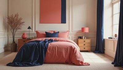

The first time I used mocha mousse paint color, I was standing in a client's bedroom holding three beige samples while her seven-year-old tested each one with a suspicious finger. The warmest sample looked beautiful in the morning and muddy by evening. That is the part of choosing paint nobody tells you: a color has to work with your actual light, furniture, clutter, and bedtime routine, not just a styled photograph.
Mocha mousse paint color has the same appeal as a favorite latte or a well-worn leather chair. It is warm, softly brown, and comforting without feeling as heavy as chocolate paint. In a bedroom, it can create a restful envelope, make white trim feel crisp, and give inexpensive furniture a more intentional look. Used carefully, it is one of the easiest ways to make a room feel finished.
What Mocha Mousse Paint Color Actually Looks Like
The name suggests a single shade, but mocha mousse paint color can describe a whole family of warm taupes, creamy browns, and muted mushroom tones. Some versions lean pink or rosy, while others have yellow, gray, or caramel undertones. That difference matters. A paint that looks creamy in a north-facing room can appear distinctly mauve beside bright white bedding.
I usually describe this family as brown softened with gray and cream. It is deeper than classic greige but lighter and less dramatic than espresso. The result can feel modern, traditional, coastal, or relaxed depending on the surrounding materials. In my own bedroom, I paired a similar wall color with an oak bed, ivory linen curtains, and a faded blue rug. The room felt warm at night without becoming visually busy.
Before buying a gallon, place a large sample beside the headboard, floor, window trim, and closet door. Look at it at 8 AM, noon, and after the lamps come on. Small sample cards are useful for comparison, but they are too small for judging how a color will behave across a whole wall.

Where to Use This Warm Brown in a Bedroom
The safest starting point is all four walls in a primary bedroom with moderate or generous natural light. Mocha mousse paint color works especially well behind a tall upholstered headboard because it creates a calm backdrop without competing with the fabric. If your room is small, continue the color onto the wall behind the bed and use lighter walls elsewhere for contrast.
A ceiling is another option, but I would not automatically use the same shade overhead. A pale cream ceiling keeps the room feeling open, while a slightly lighter version of mocha mousse paint color can make a tray ceiling or sloped ceiling feel deliberate. For a guest room, consider painting the lower half of the walls in the deeper shade and the upper half in warm white. This gives the room character without making visitors feel surrounded by brown.
An accent wall can work when the bed sits opposite a window or when the room has architectural detail worth emphasizing. It is less helpful when the accent wall simply hides an awkward layout. Paint should support the plan, not distract from a bed that blocks a door or a dresser that leaves no walking space.
Colors and Materials That Pair Well
Warm brown walls need a little contrast. My favorite combination is mocha mousse paint color with soft ivory, natural oak, muted clay, and dusty blue. Ivory bedding prevents the room from looking gray, while oak adds enough variation to keep the palette from becoming flat. A blue lumbar pillow or rug can cool the scheme without turning it into a farmhouse cliché.
For a more romantic bedroom, add muted rose, mushroom, or aged brass. For a cleaner modern look, use black reading lamps, crisp white cotton, and simple walnut furniture. Green also works, particularly olive or eucalyptus rather than a bright jewel tone. A washable rug with cream, tan, and faded rust can connect the wall color to the floor while hiding the everyday evidence of socks, crumbs, and Lego pieces.
Be cautious with orange-heavy wood, glossy red-brown furniture, and too many caramel accessories. Those combinations can push mocha mousse paint color into a dated, overly orange direction. Bring in texture instead: linen, boucle, brushed cotton, rattan, and matte ceramics give the color something to work against.

How Lighting Changes the Result
Lighting is where many bedroom paint projects go wrong. North-facing windows usually make warm brown shades appear quieter and grayer. South-facing rooms bring out their cream and golden notes. East-facing light can make the walls look fresh in the morning but more muted later, while west-facing light may exaggerate warmth during sunset.
I test paint with the room's real bulbs installed. A warm LED around 2700K generally supports the cozy quality people want from mocha mousse paint color. A very cool bulb can make it look dull and slightly green. You do not need designer fixtures to improve the result. Two plug-in sconces, a small lamp on the dresser, and one dimmable ceiling fixture often create a better bedroom than a single bright overhead light.
If your partner reads late or works from bed, use separate task lights rather than flooding the entire room. In our own bedroom, Tom has a directional lamp on his side, while I use a shaded lamp that throws a softer pool of light. The wall color looks different in each pool, which is useful information when you are deciding whether the sample feels restful or too dark.
A Practical Painting Plan
Start by moving the bed and taking down artwork, then clean the walls with a lightly damp microfiber cloth. Fill nail holes and sand glossy patches so the new finish does not highlight every old picture frame. If the existing wall is very bright white, a tinted primer can help create more even coverage. Most bedrooms need two finish coats, especially when moving from pale beige to a deeper neutral.
Choose an eggshell or washable matte finish for walls. Flat paint can look beautiful but is harder to wipe clean around a bed, nightstand, or child’s room. Use a quality angled brush around trim and a nine-inch roller for broad surfaces. Paint one wall first, let it dry fully, and live with it overnight before committing to the rest.
For a budget refresh, paint only the wall behind the bed, replace yellowed lampshades, and add new ivory bedding. A quart-sized test can cost around $10 to $20, while a full bedroom refresh with paint, supplies, and simple textiles can stay near $300 to $700 depending on room size and product choices.
Common Mistakes to Avoid
The biggest mistake is choosing mocha mousse paint color from a phone image. Screens alter warmth, brightness, and contrast, so always judge a physical sample in your room. The second is pairing a warm wall with icy white trim. That contrast can look sharp in a showroom but harsh beside soft bedding. Try a warm white with cream, beige, or a small amount of gray instead.
Another mistake is forgetting the floor. Honey oak, reddish hardwood, and cool gray laminate each change how the wall reads. Put your sample on a movable board and carry it around the room rather than judging only the wall beside the window. Notice whether the color makes the floor look pink, orange, or pleasantly balanced.
Finally, do not decorate every surface in the same brown family. The room needs light, dark, rough, and smooth elements. A dark wood dresser may be beautiful, but pair it with pale bedding, a woven basket, and reflective brass or ceramic details.
This weekend, buy two or three sample pots, paint large boards, and place them beside your bed at different times of day. If one still looks inviting after the lamps come on and the laundry basket is in view, you have found the right direction. Your bedroom does not have to be perfect. It just has to be yours.