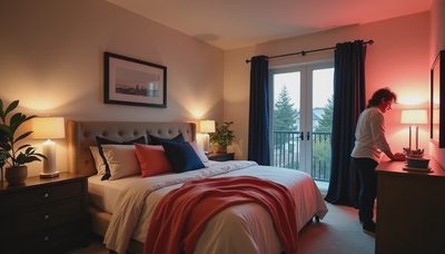

Last winter, Sophie taped a hot pink drawing over the beige wall in our bedroom and announced that it was “too boring to sleep in.” She was not entirely wrong. A neutral bedroom can feel calm, but it can also feel flat, chilly, or like a staged listing. Warm neutrals interior design solves that problem by layering creamy whites, sand, camel, taupe, clay, and soft brown with enough texture to make the room feel lived in.
After designing bedrooms for eight years and redesigning my own room three times, I have learned that the best palette is not the one that photographs most perfectly. It is the one that helps you get dressed at 7 AM, find your phone at 9 PM, and still looks good when laundry is waiting on the chair. Here is how I would build it.
Start with the right neutral foundation
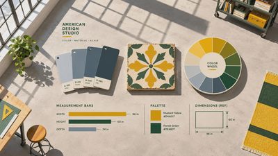
The first decision is temperature. A warm neutral has an undertone of yellow, red, or brown, while a cool gray often carries blue or green. Hold paint samples against your flooring, trim, and largest upholstered piece before buying a gallon. Benjamin Moore White Dove, Sherwin-Williams Natural Linen, and Farrow & Ball Skimming Stone are useful starting points, but every room changes color with its windows and bulbs.
In a foggy San Francisco bedroom, I would avoid a stark blue-white. It can look clean at noon and icy at night. Instead, I might use a soft cream on the walls, a slightly deeper beige on the ceiling, and white trim for definition. In a sunny bedroom with honey oak floors, a muted mushroom or pale putty can prevent the room from becoming too yellow.
Paint samples are inexpensive insurance. Put two-foot squares on different walls and observe them in morning light, afternoon light, and lamplight. A color that seems almost invisible at the store can become distinctly peach or green at home. That small test is more useful than studying a hundred online bedroom photos.
Build depth with texture, not more color
Warm neutrals interior design works when the surfaces do different jobs. If the walls, duvet, rug, curtains, and headboard are all the same smooth beige, the room will look unfinished no matter how expensive the furniture is. Contrast linen against wool, nubby cotton against wood, and a matte ceramic lamp against a softly polished metal detail.
Here is what I did in my own room: I paired a simple oatmeal linen duvet with a chunky cream throw, a vintage-style wool rug, and a walnut nightstand. The colors are close, but the materials keep the eye moving. A linen duvet cover from Quince or a cotton option from Target can create the same relaxed effect without a designer budget. Add two euro pillows in a woven fabric rather than purchasing six decorative pillows that migrate to the floor every night.
Window treatments are another opportunity. Unlined linen-look panels soften hard edges and filter morning glare, while woven shades add privacy without making a small room feel closed in. For better sleep, layer them with blackout shades in a bedroom that faces a streetlight. Function should lead here; a beautiful room that wakes you at 5:30 AM is not a successful bedroom.

Choose furniture that keeps the room practical
A warm palette cannot rescue a frustrating layout. Leave roughly 24 inches of walking space beside the bed when possible, and measure every doorway before ordering a dresser. I once designed an $80,000 primary suite where the owners could not fully open one closet door because the bed was oversized. The marble was lovely. The daily irritation was not.
For a smaller room, choose a bed with visible legs or a slim upholstered frame rather than a bulky platform. A six-drawer dresser around 60 inches wide often provides more useful storage than two tiny chests. The IKEA MALM is a familiar budget option, while the West Elm Anton dresser offers a more substantial look at a higher price. Whichever you choose, anchor it to the wall and keep the top mostly clear.
Nightstands should be tall enough for the mattress, with a drawer for chargers, medication, or reading glasses. A $150 table with one drawer can work better than a $900 open shelf. I also like a small basket for throw blankets and a lidded box for the visual clutter that appears after bedtime. Calm comes partly from color, but it also comes from giving objects a place to land.
Add contrast so beige does not become bland
The phrase warm neutrals interior design does not mean every item must be pale. A little contrast gives the eye somewhere to rest. Try espresso-stained wood, aged brass, charcoal art, or a muted olive accent. In a child-friendly bedroom, a cinnamon-colored quilt or terracotta lumbar pillow adds personality while remaining easy to replace as tastes change.
Black can work too, especially in small doses. A black reading lamp, curtain rod, or thin picture frame creates structure against cream walls. I prefer charcoal in a sleep-focused room because it feels softer, but the right choice depends on the rest of the home. Repeat one darker element at least twice so it looks intentional rather than accidental.
Art is where the room becomes yours. A framed family photograph, a small landscape, or one of Sophie’s drawings can prevent a neutral scheme from feeling like a hotel. Choose a mat with a warm white tone, and hang the piece low enough to see from bed. You do not need a gallery wall; one meaningful print may do more than ten generic abstracts.

Plan lighting for real evenings
Lighting determines whether warm neutrals interior design feels restful or muddy. Use at least three layers: general light, task light, and low evening light. A ceiling fixture handles cleaning and dressing, but it should not be the only source. Two bedside lamps with warm LED bulbs make reading easier and eliminate the harsh overhead glare that makes even beautiful paint look unpleasant.
Look for bulbs around 2700K for a warm residential glow. If you read in bed, choose a lamp with a shade that hides the bulb and a switch you can reach without sitting up. The Schoolhouse Luna lamp has a classic shape, while a simple ceramic lamp from Pottery Barn or Target can provide the same warm pool of light for less. Plug-in sconces are useful when nightstands are narrow, although installation should be handled safely and according to local requirements.
Add a dimmer to the main fixture if possible. I use full brightness while folding laundry, then lower the light after brushing my teeth. That small transition tells my brain that the room is changing from work space to sleep space.
A weekend plan for your own bedroom
If you want to try warm neutrals interior design without renovating, begin with a 30-minute edit. Remove anything that belongs elsewhere, clear the nightstands, and photograph the room from the doorway. Then collect paint chips, fabric samples, and one piece of wood or metal from the room. If the samples look harmonious in both daylight and lamplight, choose one wall color and one textile to introduce first.
Next, change the bulbs before buying accessories. Lighting can make a $40 duvet look inviting and a $400 duvet look gray. Add one textured layer, such as a wool throw or woven basket, and move one piece of furniture to improve circulation. Sleep in the room for a week before making another purchase. You will notice whether the lamp is reachable, whether the curtains block enough light, and whether the dresser actually works.
Your bedroom does not have to be perfect. It just has to be yours. This weekend, clear one surface, test three paint samples, and switch your bedside bulb to a warm dimmable option. That is enough to begin.