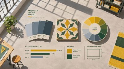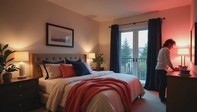

At 9 p.m., when the laundry is still on the chair, the last thing a bedroom needs is a color that feels like another chore. Viva magenta paint can work beautifully here, though: treat its rich, raspberry-red energy as an accent, pair it with quieter neutrals, and test it in your room before committing. I would start with the wall behind the bed or a small piece of furniture rather than painting every surface at once.
What color is Viva Magenta?
Viva Magenta is Pantone's Color of the Year for 2023, a bold red with a pinkish, berry-like character. It's not a delicate blush or a straightforward fire-engine red. Depending on the light and the paint you choose, it can look warmer and redder or cooler and more raspberry-toned.
The important shopping distinction: viva magenta paint is often a color description, not the name of a standard can you'll find from every manufacturer. If you want a close match to Pantone's color, bring a physical Pantone reference to a paint store and ask whether it can be matched in your preferred interior paint. A match is an approximation, not a guarantee: paint sheen, surface texture, lighting, and the color reference itself all affect the result.
If you simply love the look, you have more freedom. Ask for deep raspberry, berry red, or reddish magenta samples, then choose the one that looks right beside your bedding and floor. A screen can suggest a direction, but it can't show you exactly what a painted wall will look like in your bedroom.
Where to put viva magenta paint in a bedroom
My first choice is the wall behind the headboard. You get a generous dose of color when you enter the room, but it isn't directly in your line of sight when you're lying in bed. This is especially useful if one person wants a bold room and the other wants things a little calmer.

For a smaller commitment, paint a dresser, a freestanding bookcase, or the inside of a recessed shelf. A piece of furniture also lets you take the color with you if you move. Use a product suitable for the surface and follow its preparation instructions; slick factory finishes often need cleaning, sanding, and an appropriate primer before paint will adhere well.
In a child's room, a painted lower section of wall can feel playful without competing with every drawing and toy. Mark a level line rather than relying on the ceiling or floor to be straight, especially in an older home. Leave enough neutral wall above it for art that will change as your child grows.
A whole room can be lovely if you enjoy saturated color. Just know that a strong red-pink on all four walls will feel more enveloping than a single sample square. Bring in larger areas of softer bedding and curtains so your eye has somewhere to rest.
Colors and materials that make it feel restful
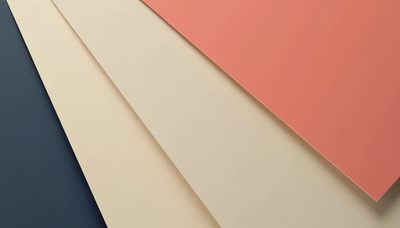
Warm white is my favorite companion for viva magenta paint. Look for a soft, creamy white rather than assuming the brightest white on the card will work; a stark contrast can make the pink-red feel even louder. Sample the two colors next to each other because a cream that looks gentle alone can turn noticeably yellow beside a berry shade.
Natural wood brings warmth without introducing another strong color. A medium-toned wood nightstand, an oak dresser, or a woven shade gives the palette some texture. If your floor is already orange or red in tone, put the paint sample right against it before deciding. The undertones may be lively together, but not everyone wants that much warmth.
For bedding, try oatmeal, soft gray, or an off-white quilt. Muted olive or sage can be a pleasing counterpoint, especially in a pillow or throw rather than another full wall. Navy makes the contrast moodier and more graphic; pale pink creates a gentler, layered look. You don't need every one of these colors in the same room. Pick a neutral, one supporting color, and let the magenta do its job.
Black accents, such as a slim lamp base or picture frame, add definition in small amounts. Brass can bring warmth, but there's no need to replace perfectly good hardware just to make the palette work.
Sample for the light you actually live with
Paint at least two sample boards, leaving a white border around each so the existing wall color doesn't distort your impression. Move them from the headboard wall to the wall near the window and check them in morning light, on an overcast afternoon, and with your bedside lamps on at night. A color that feels cheerful at breakfast can look surprisingly intense under a warm bulb after dark.
Put the boards beside the pieces staying in the room: your floor, headboard, curtains, and largest bedding layer. Those surfaces occupy more visual space than a little paint chip. If one sample makes your curtains look dingy or pulls an unwanted orange note from the floor, try a cooler or less saturated version.
For walls, matte or eggshell finishes are common choices; check the manufacturer's guidance on cleanability and sheen. A washable finish can be useful near a child's bed, but a higher sheen may make wall imperfections more noticeable. On furniture, choose a finish and paint formulated for the wear that surface will get.
Deep colors may need a suitable primer and multiple coats for even coverage. Ask the paint counter about the specific color and product, and buy enough from the same batch when practical. Good preparation matters more than rushing to see the final color by bedtime.
This weekend, bring home two or three berry-toned samples and make those movable boards. Look at them beside your bedding after the lamps are on. Your bedroom doesn't have to be perfect. It just has to be yours.